pendant
Client: pendant
Industry: Beverage
Services: Visual Identity and packaging
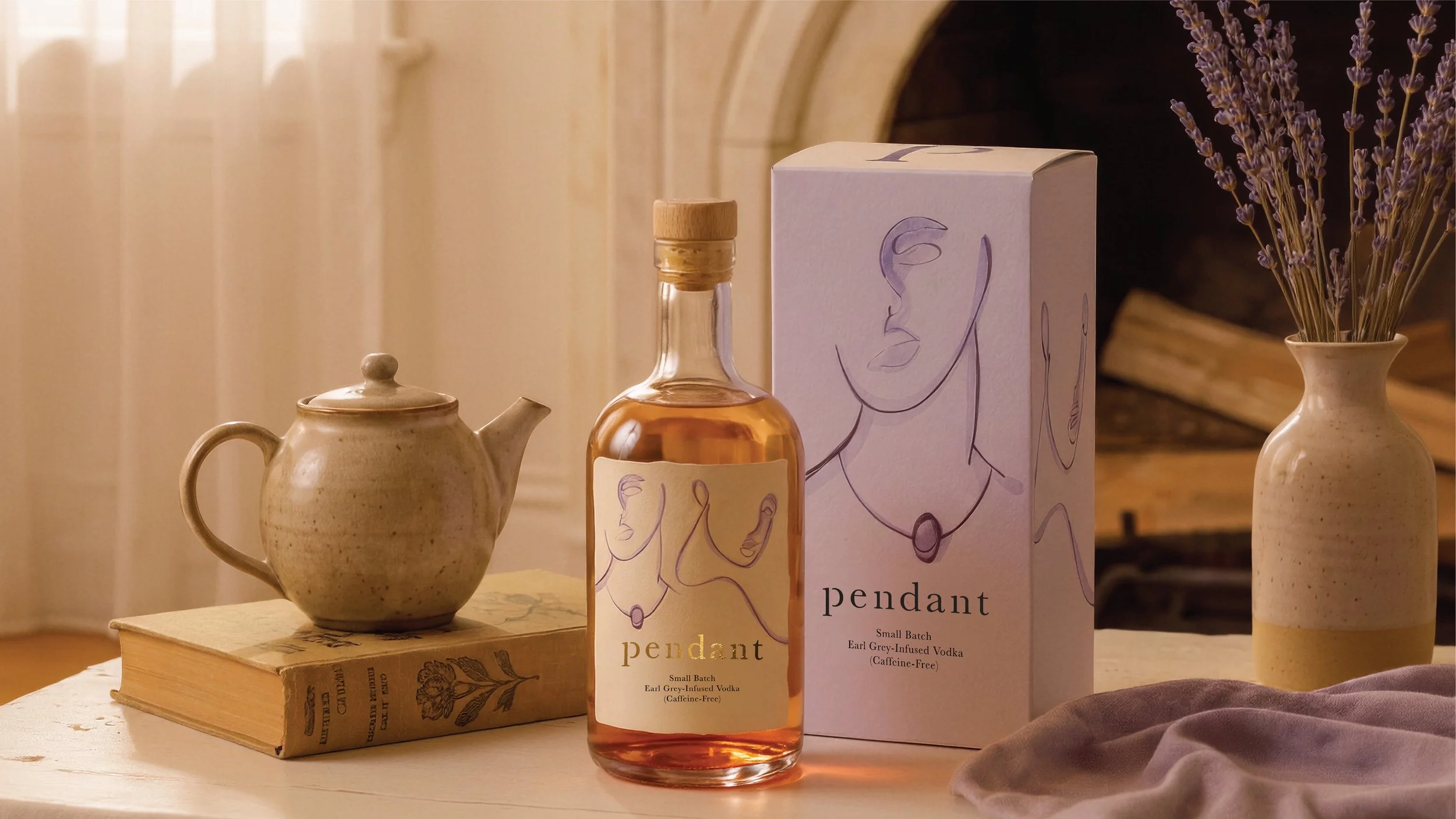
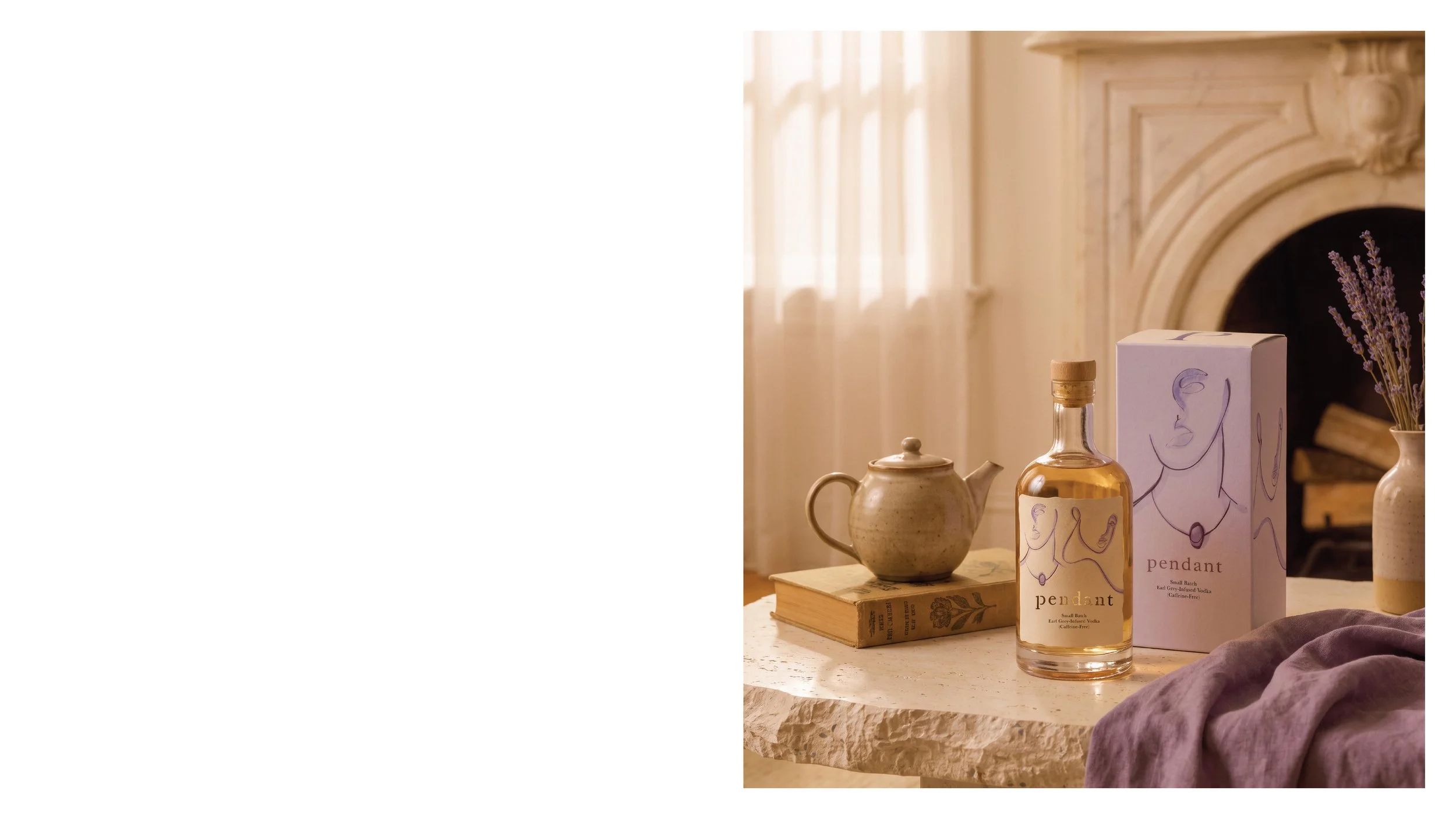
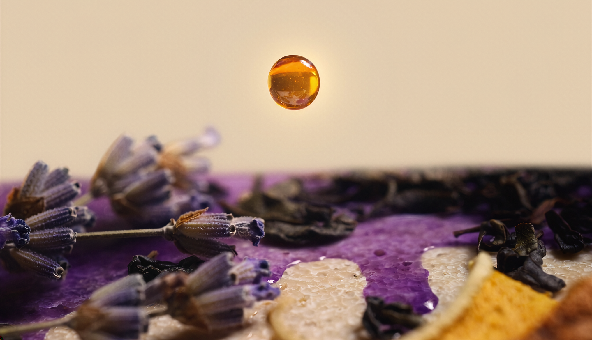
pendant is a small-batch vodka infused with Earl Grey tea. The idea was to take something familiar—the quiet ritual of making tea—and turn it into something unexpected.
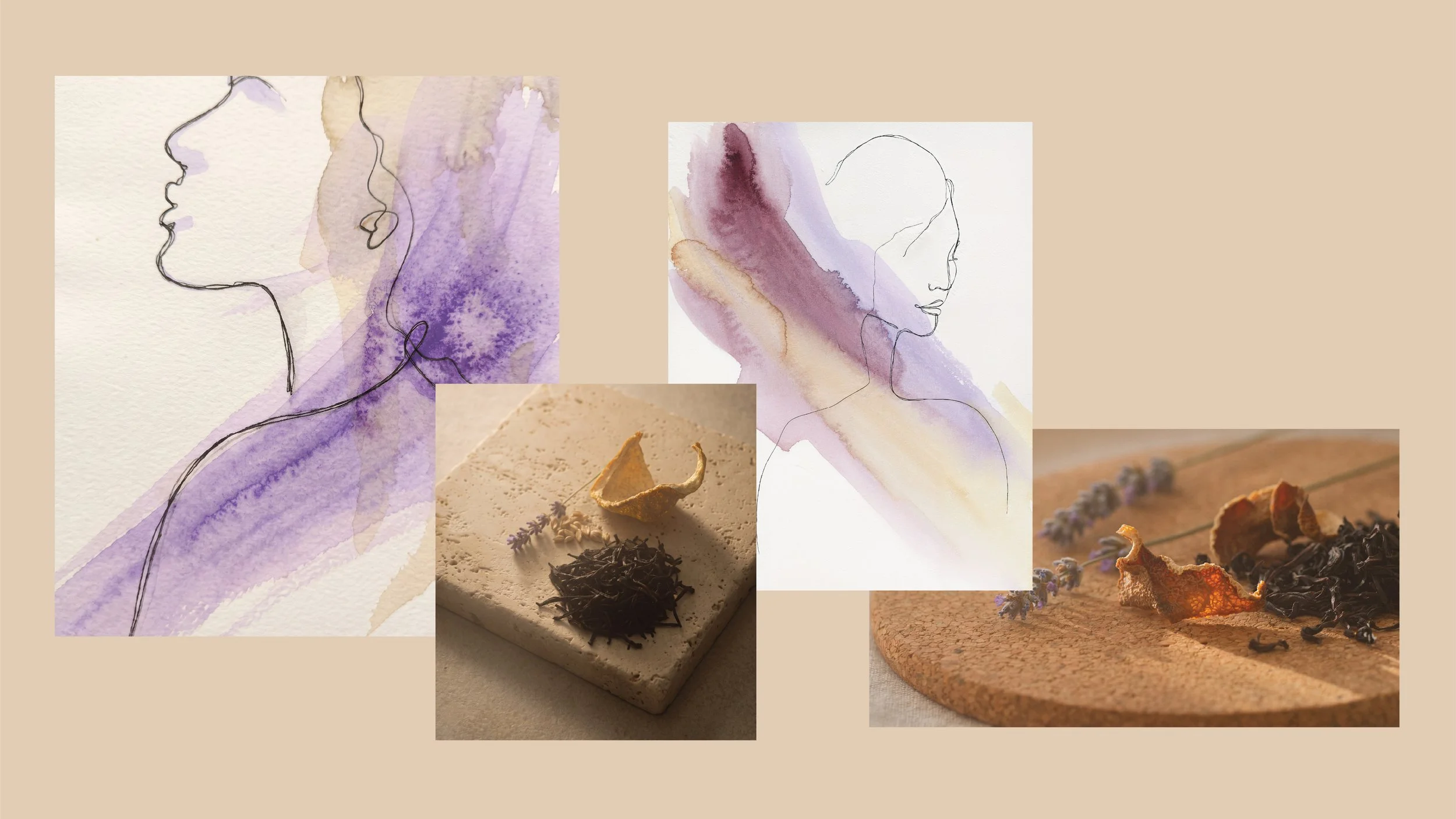
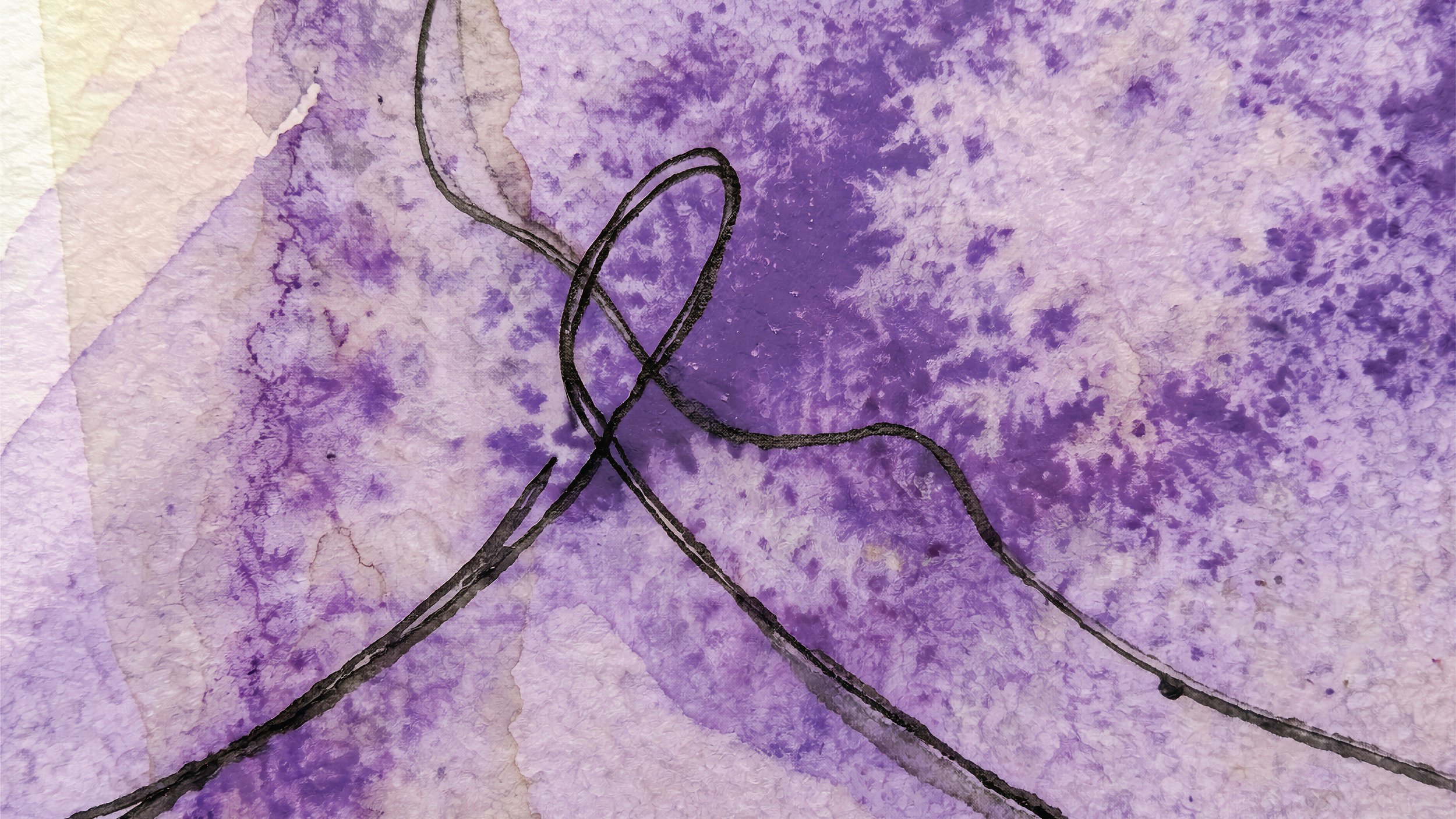
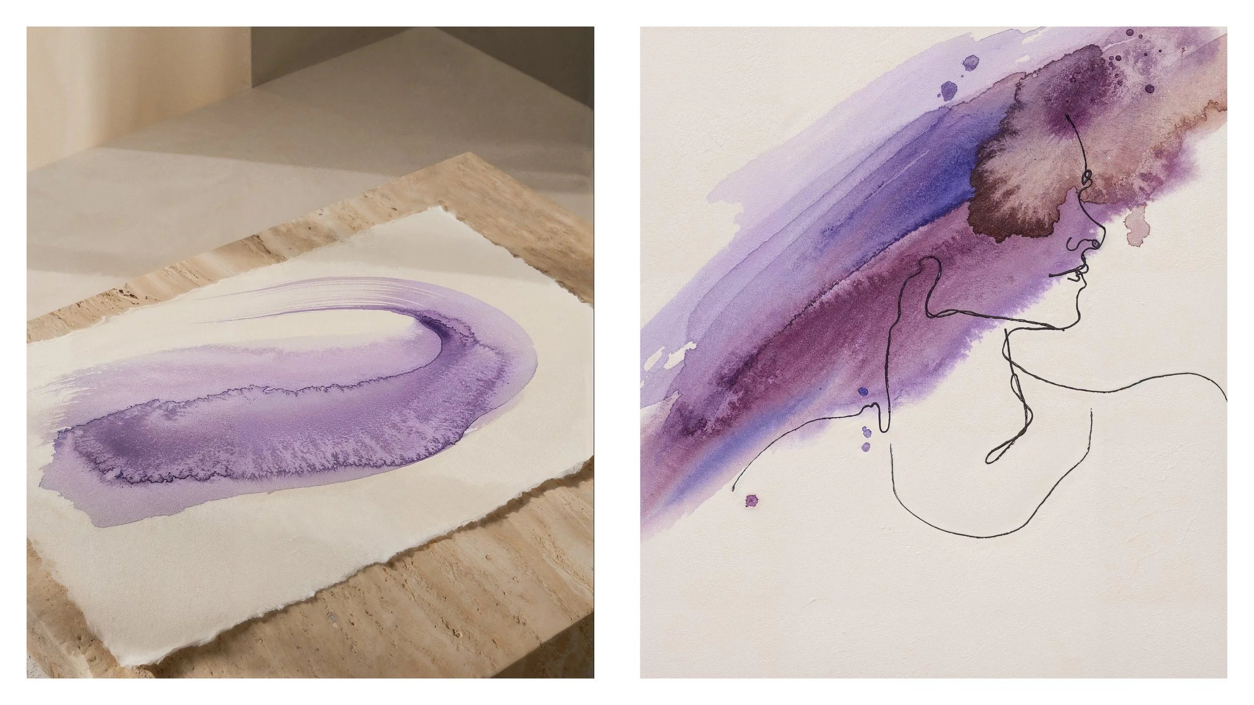
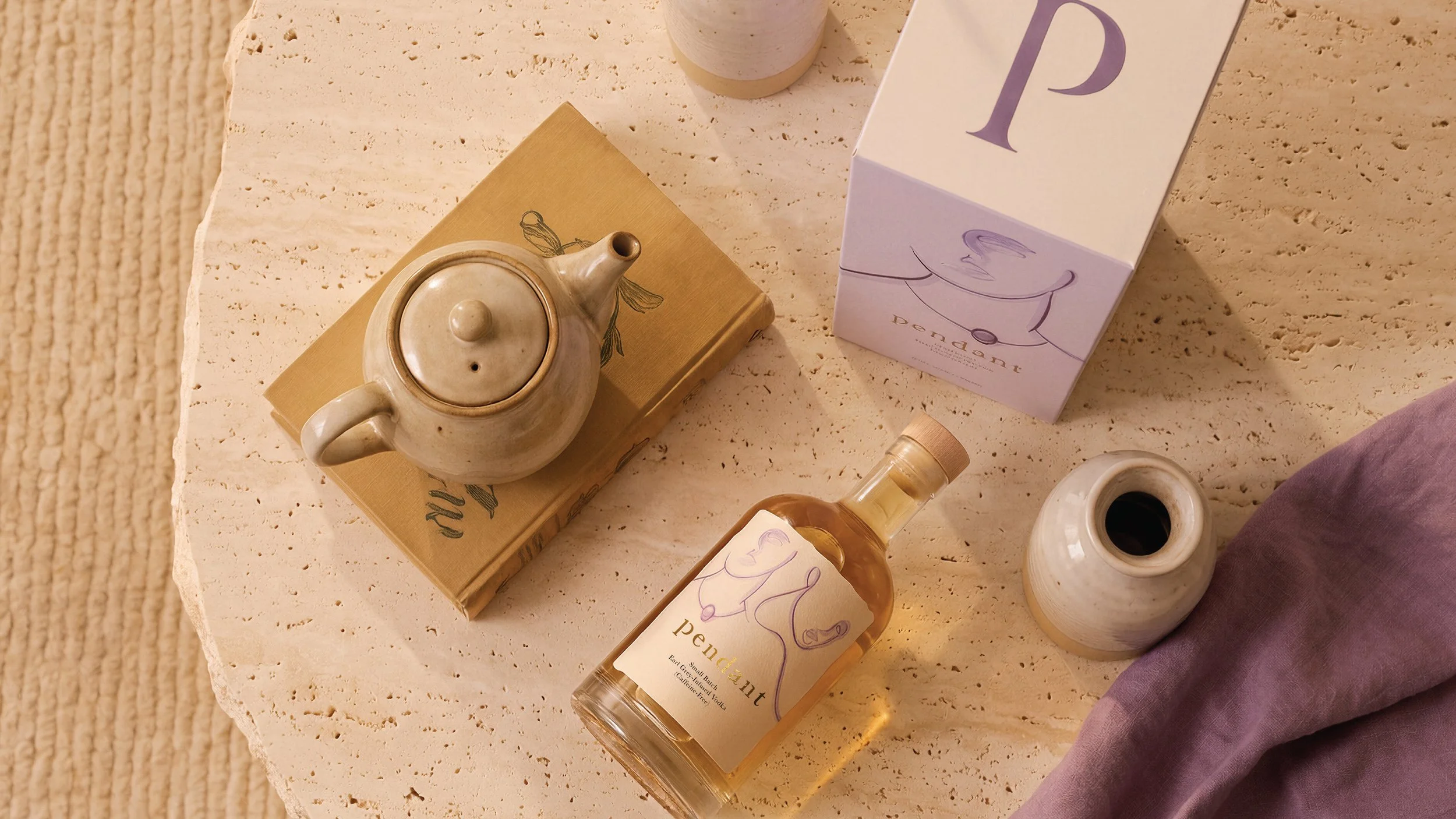
The identity brings together the softness of tea and the character of vodka. Watercolor illustrations highlight the botanical ingredients, while sculptural shapes and tactile materials give the brand a more physical, crafted feel. The result is refined, but not overly serious, with a sense of curiosity that reflects the experience of discovering a new flavor.
The name Pendant suggests something that hangs, catches the eye, and becomes part of a larger composition. That idea carries through the typography, illustrations, bottle, and packaging, making the product feel less like a traditional spirit and more like an object you want to keep and explore.